Box Plot provides an intuitive graphical representation of the five number summary of a dataset. The five number summary consists of Minimum, Q1, Q2 or Median, Q3, and Maximum of a dataset. John W. Tukey introduced the concept of Box Plot in his book Exploratory Data Analysis, published in 1977. It is also referred as Box & Whisker Plot.
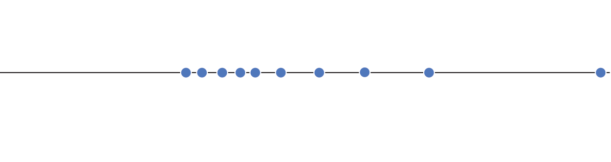
Boxplots are used to better understand how values are spaced out in different sets of data. To understand the method behind constructing a boxplot, imagine a set of values that are spaced out along a number line. First, draw a line at the median of the data set — the value in the set which divides it evenly in half, with an equal number of points smaller and larger. If there are an even number of points in the dataset (as in the example below), the median is halfway between the two central points.
Next, divide each half of the dataset in half again, dividing it into four even sets of points. These four sections are called quartiles. The leftmost line marks Q1, the first quartile, while the rightmost line marks Q3 or the third quartile (the median can also be called Q2).
Connect the lines you've drawn. This boxplot is starting to look more boxy...
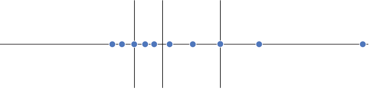
Every boxplot has lines at Q1, the median, and Q3. The other major feature of a boxplot is its whiskers.
Whiskers With All Points Visible
To draw the whiskers when all points are displayed, we can first calculates the interquartile range (IQR), which is the distance between Q1 and Q3.
Next, we look at a subset of the data, ranging between 1.5 × IQR below Q1 and 1.5 × IQR above Q3 (anything outside of this range is called an outlier). We then draw lines at the smallest and largest point within this subset. These lines define our whiskers.

How to Read a Boxplot
First of all, while it was useful thinking of boxplot data as lying on a number line, it's more common to see boxplots rotated vertically.
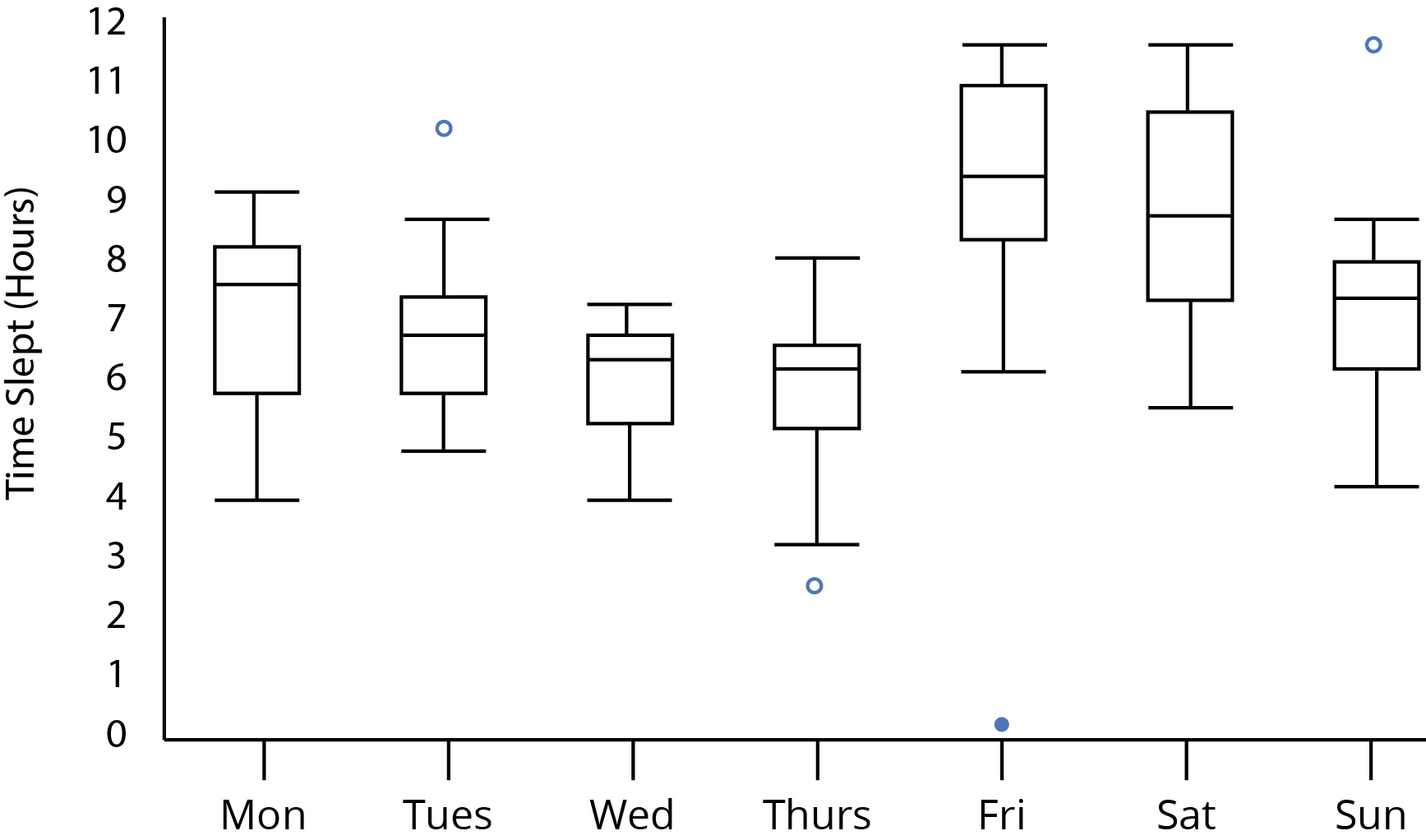
So far, we've looked at boxplots for a single series. Graphs such as histograms give a more complete picture of a single series, but the real strength of a boxplot is comparing multiple series at a glance. Take the example below, showing hours slept for each day of the week, for a group of 20 high school students.
Boxplots show so much information, it's useful to examine this one feature by feature.
The Medians
To get a sense of the general difference between the days, we can look at the changes in median values.
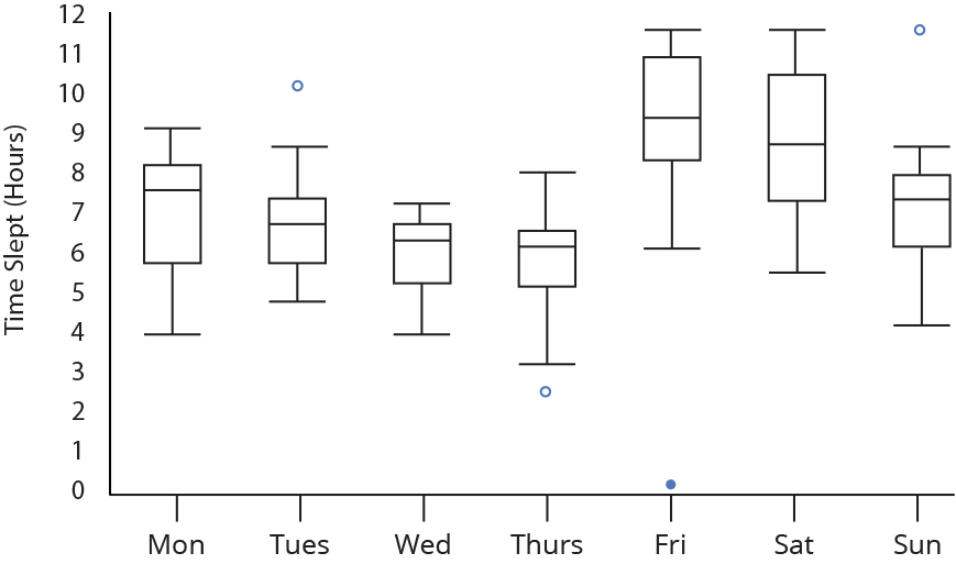
Overall, the students sleep less and less as the week goes on, then they sleep more on the weekend.
The Boxes and Whiskers
While the boxes and whiskers show the same overall trend as the medians, they also contain much more information. Some example information you could draw from the boxes:
On weeknights, the boxes are not symmetrical. Remember that in the upper region (Q2 to Q3) and the lower region (Q1 to Q2) there are the same number of points. This means that the 5 students are more closely packed together in the upper region.
The large box on Saturday shows how inconsistent sleep habits are. The 10 students in the middle two quartiles sleep in a range that's about 4 hours wide.
For days without outliers, the whiskers represent the minimum and maximum values. We see that students have relatively diverse sleep patterns, with the narrowest total range (on Wednesday) being over 3 hours.
Weekday whiskers reinforce the pattern that the 10 students who sleep the least have very diverse (spread out) sleep patterns.
The Outliers
On a boxplot, the outliers stand out and seem important. While they're interesting, remember that they are kept separate because they are different from the overall trend, and shouldn't be used to make generalizations. These outliers only represent 4 out of 140 total data points! It's OK to say "one student barely slept on Friday night" but NOT OK to say "on Fridays, students barely sleep".
What Type of Data Belongs on a Boxplot?
Usually, boxplots are used to compare multiple different series of data. It's perfectly valid to create a boxplot for one series, although a histogram might give a more complex or complete picture of the data. Some examples of data sets to compare:
- Multiple trials of the same experiment: In many Scientific fields, when the same experiment is run many times, the results are tracked in a boxplot to show consistencies or inconsistencies across trials.
- Multiple trials of different experiments: Many similar experiments might be run, with some condition or parameter changing each time. A boxplot might help find trends or patterns. The above example of tracking hours slept on various days fits this model.
- Data broken up by category: A boxplot can serve a similar function as a bar graph, but with many values in each category. You could make a boxplot of batting averages, with different trials corresponding to different teams, for example.
You should also make sure that the data in each series follows some guidelines:
- The data sets must be measuring the same value, with the same units!
- Boxplots should not be constructed for very small data sets. A data set with only three points in it, for example, shouldn't logically be divided into four quartiles. In these cases, you can just graph the data as a scatterplot, without any boxes.
- Usually, different trials should contain the same total number of data points. If one set is much larger than another, for example, it has a larger chance of containing random outliers. Someone looking at your boxplot and seeing one series with five or six outliers, and no outliers elsewhere, might draw incorrect conclusions.
Another Example
Let us understand the power of box plot through a series of examples; the following example shows the box plot along with the sample data.
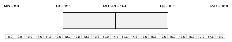
The box represents the inter quartile range (IQR = Q3-Q1) where its left border (also called hinge) corresponds to the first quartile (Q1) and the right border corresponds to the third quartile (Q3). Therefore, the middle 50% of data values fall within the box. The line in the middle represents the median of the data. The left whisker represents the smallest 25% of data values with its left most end corresponding to the minimum value of the data. Similarly, the right whisker represents the largest 25% of data values with its right most end corresponding to the maximum value of the data.
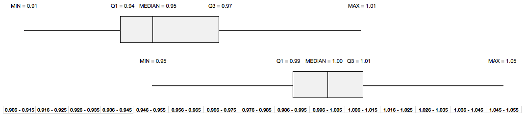
Let us look at the second data set and the corresponding box plot. The data has been superimposed on the histogram with box plot aligned perfectly on the top to give you a crisp and easy to understand picture.
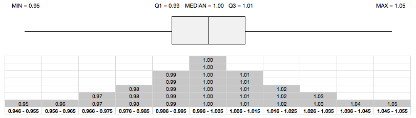
The histogram in the figure clearly suggests that:
1. It has no skew implying that it has symmetrical distribution.
2. It has long tails i.e. it possibly has outliers.
Now, it is time to look at the box plot. Notice that both the whiskers are much longer than the length of the box (IQR) - an indication of the possible presence of outliers. In fact, Tukey suggests that an outlier is a point that is greater than or less than 1.5 times the IQR. Here is the same box plot, but with outliers (0.95 and 1.05) clearly highlighted as per Tukey's recommendations.
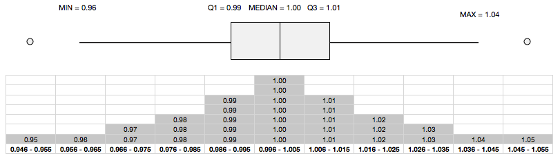
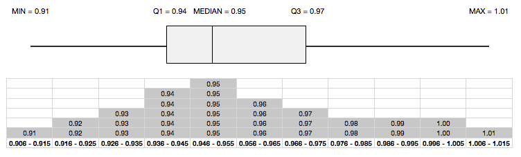
The above box plots (with or without outliers) also reveal that the two whiskers are of equal length and the median lies right in the middle of the box - an indication of symmetrical distribution. Any deviation from this leads to a non-symmetrical distribution, as illustrated in the following box plot.
Box plot also serves as a great way to quickly compare two or more series by juxtaposing the box plots of the series to be investigated. The following plot shows the previous two box plots juxtaposed clearly to highlight the differences (or similarities) in central tendencies and dispersions.
Important Observations
1. Box plot is based on robust statistics, i.e. it is more tolerant (or robust) to the presence of outliers.
2. It gives an indication of shape of distribution in terms of symmetry or skewness.
3. It is an excellent means to determine if there are similarities (or differences) between two or more data sets by juxtaposing their box plots.
 |  |
Box Plot – http://heelpbook.altervista.org/2015/box-plot/ – Box Plot provides an intuitive graphical representation of the five number summary of a dataset.